I was thinking about buying a few bank stocks but they are very highly priced. I remember when the CBA shares were first floated, they were dirt cheap compared to now days.
This article appeared in the May 2013 ASX Investor Update email newsletter. To subscribe to this newsletter please register with the MyASX section or visit the About MyASX page for past editions and more details.
What the charts say about key financial indices and the big banks.
Are Australian bank shares too expensive and just a dividend yield play? Should we consider the banking sector as a whole, compare one bank’s share price with another, and look for correlation between different stocks?
Given the current markets and world economy, should we be making assumptions about possible future risk events that could affect the banks – the unknowns still loitering in Europe, the earnings uncertainty, and the possibility of local bad debts increasing?
Banking sector performance
When looking for investment candidates, is it useful to look at the performance of the sector?
The underlying theory supporting the study and comparison of sector performance is that if a sector is declining, there must be something in the economy working against the stocks in that sector; otherwise the decline would be limited to individual stocks. And the converse, that when a sector is rising it suggests most of the stocks in it must have a positive outlook caused by something in the general economy.
The notion of sectors and sector indices, and which stocks are in which sectors, is not discussed much and results in much confusion and misunderstanding for investors.
When looking at banks and the banking sector, it is important to note a couple of important points. First, stocks are allocated one of the 10 universal GICS sector codes, so all the stocks in any one sector can be identified. Second, there are three sector indices that might be relevant to studies of banking stocks:
- XFJ (S&P/ASX 200 Financials sector index). Currently includes 36 stocks from the S&P/ASX 200 index (XJO), including 16 REIT stocks.
- XPJ (S&P/ASX 200 A-REIT sector index). A sub-set of the XFJ, currently comprises 16 Australian Real Estate Investment Trusts (A-REIT) from the list of 36 securities in the XFJ sector index.
- XXJ (S&P/ASX 200 Financials sector index excluding A-REITs). Another sub-set of the XFJ, but with the A-REIT stocks excluded. Currently comprises only 20 banking, finance and insurance stocks.
The accompanying chart shows the S&P ASX 200 Financial sector (XXJ) index since 2004. It clearly shows the market peak in late 2007, followed by the bear market crash through 2008, and mostly sideways ranging from late 2009 to 2012. This sector has broken to new five-year highs in 2013.
The XXJ sector index

Source: © April 2013, Robert Brain
The big four banks have a combined market capitalisation today of about $360 billion, which represents about 78 per cent of all 20 stocks in the XXJ. This means that most of the time, the chart of the XXJ will probably look very similar to the chart of each of the big four banks. Or is it?
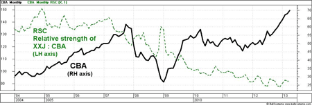
The chart below shows Commonwealth Bank (CBA, the thick black line) over the same time as the chart above. A quick visual comparison of the XXJ and CBA shows they both tend to peak and trough at about the same time. Many of the bumps along the two charts coincide. But the key difference is the height of each peak, and in fact the relative height of one peak to another.
Notice the peak in late 2009 and early 2010. CBA almost reached its highs of 2007, while the XXJ peaked a long way below its highs. Also, in April 2013 (the very end of the charts) CBA is clearly rising higher than its 2007 peak, while the XXJ is still below its 2007 high.
Commonwealth Bank and relative strength (RSC) compared to XXJ

Source: © April 2013, Robert Brain – larger chart and more details: Brainy’s Share Market Toolbox
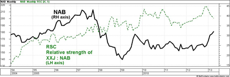
Now look at the chart of National Australia Bank (NAB) below and note its peaks and troughs. It is much more like the chart of the XXJ, rather than that of CBA. Out of the big four banks, these two banks are the extremes in price variation.
National Australia Bank and relative strength (RSC) compared to XXJ

Source: © April 2013, Robert Brain
But what about a real measure to compare them? The relative strength comparison (RSC) is a chart tool to do exactly this, and is found in many charting software packages as a chart indicator.
The CBA and NAB charts above also show the RSC (dotted green line) comparing the share prices to the value of the XXJ sector index. In this case it is calculated by dividing the value of the XXJ by the company’s share price. For example, in April 2013 the XXJ was about 6500 and NAB was about $32, and dividing 6500 by 32 results in the RSC value of 203, which can be seen on the chart above (left hand axis). [In fact, the RSC shown here is the inverse of the RSC.]
How to interpret this?
Looking at the chart of NAB and the RSC, we can see the RSC has risen across the chart over the nine years of the chart, suggesting NAB has lagged more and more behind its peers in the XXJ index. As for CBA, the RSC has fallen across the chart, especially in the past four years, indicating CBA has been strongly outperforming its peers in the XXJ.
Is this useful? We might anticipate CBA will eventually revert back to the mean and swing downwards towards the sector index, and NAB will pick up and likewise swing upwards towards the sector index. But in reality, these monthly charts covering several years indicate that if we had adopted that approach just two years ago we would have lost money today.
The devoted technical analyst who chooses to strongly follow the price charts with simple strategies might take the view that studying the related sector adds a level of complexity to investment decisions, without adding any value to the decision-making. They might simply adopt the adage “the trend is your friend” as the underlying principle for most of their decision-making, and employ sound risk-management principles.
‘The trend is your friend’
The chart of CBA above shows a clear uptrend of higher peaks and higher troughs since the trough in the third quarter of calendar 2011, some 19 months ago. In this time, CBA has increased 64 per cent (annualised to 37 per cent per annum). Over a similar period, even though NAB has underperformed its peers, it has still increased about 50 per cent. Mind you, even though NAB is up about 50 per cent, it did most of this in 2009 and has moved sideways with no clear trend since then.
One of the six key tenets of Dow Theory basically says “a trend is a trend is a trend, until it is no longer a trend”. Once a trend is in place, it is statistically likely to continue. The uptrend is over when we no longer see a higher peak and higher trough. If we were keen enough we could also view the weekly chart and use a 30-week moving average, as advocated by Stan Weinstein in his book ‘Secrets for Profiting in Bull and Bear Markets‘.
Sound risk management
If we were invested in a bank today, and fearful it is overpriced and wanting to protect our capital in case of a sell-off, we could implement a stop-loss strategy, a pre-determined point at which you sell, to cleverly take some money off the table.
Commonwealth Bank (CBA) showing support and resistance levels

Source: © April 2013, Robert Brain
The daily chart shown here (as distinct from the weekly or monthly chart) of Commonwealth Bank is important because it shows the price at which all market participants were happy to settle their positions overnight. We see a series of higher peaks and higher troughs – a confirmed uptrend – over the past six months. It also shows short horizontal lines to indicate levels of price support and resistance.
The short lines drawn under the price are the support levels at the price troughs. They indicate progressively rising support levels and price points where a stop-loss value could be set. Notice they are close to whole dollar values, first at about $58, then $61, then $65, and $67. Also note that the line 3 at about $67 was a level of resistance. For several days in February, no one was convinced CBA shares were worth more than $67, so there was a pause in the rising price and a short sell-off back to point 4 at $65. That resistance level at $67 later became a support level in early April (indicated at 6). This shows the switch in investor opinions regarding fair value at the $67 price point.
If the price can clear the last peak at 5 where the daily close was $70.58, then it is likely to continue rising (but not guaranteed). A stop-loss could be placed a few cents below the last support level at 6 (the daily close was actually $66.93). If the price breaks below the latest support level, and hence our stop-loss level, then the uptrend could be over and we ought to sell to protect our capital in case a new downtrend is beginning.
The definitions for “over priced” and “over valued” are vague, not reliable, and can be distracting. The study of sectors might be useful but can be time wasting, resulting in missed opportunities. It can be beneficial to simply follow the price trend on the chart and use sound risk-management strategies, including a stop-loss. At the end of the day, does your own chosen approach seem sensible and protect your capital? More profit and capital protection strategies will be discussed at this year’s ATAA national conference in Sydney in June.
About the author
 Robert Brain is a sharemarket analyst and nimble short-term investor, and runs Brainy’s Share Market Toolbox web-based business supporting investors and traders. He is a national director of the Australian Technical Analysts Association (ATAA), and vice-president of the Melbourne ATAA Chapter. The charts are produced using the Australian BullCharts charting software and Robert heads up the Australian BullCharts User Group.
The definitions for “over priced” and “over valued” are vague, not reliable, and can be distracting. The study of sectors might be useful, but can be time wasting, resulting in missed opportunities. It can be beneficial to simply follow the price trend on the chart and use sound risk management strategies including a stop loss. At the end of the day, does our own chosen approach seem sensible and protect our capital?
The devoted technical analyst who chooses to strongly follow the price charts with simple strategies might take the view that studying the related sector adds a level of complexity to investment decisions, without adding any value to the decision-making. They might simply adopt the adage “the trend is your friend” as the underlying principle for most of their decision-making, and employ sound risk-management principles.